Mayer’s Multimedia Principle says that “People learn better from words and pictures than from words alone.” The images graphic designers create can play a big role in the learning process and help learners recall information. A collaborative study with Seoul National University and the University of California found that graphics generally help learners have a more positive experience, but the type of graphic makes a difference. There were two types of images that did not help the students recall information after the initial assessment: images that were considered simply “decorative,” such as an aesthetically pleasing icon that did not directly pertain to the lesson, and images that were “seductive,” such as an interesting picture that was not tied directly to the aim of the lesson. Those who were given “instructive” graphics showed a better recall of the material. We must create instructive graphics for the sole purpose of assisting the learner. Below are several best practices to follow when creating custom art.
Keep it simple
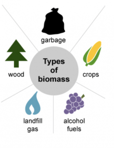
Graphic designers want to be creative and sometimes create graphics that are intricate and beautiful, but the instructional message can be lost in the intricacy. Sometimes the message that the learner needs calls for a much simpler graphic. The graphic below shows basic illustrations to help the learner think of different types of biomass.

Consistency
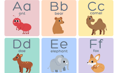
Cognitive load can occur when images are not cohesive. Cognitive load results in a learner being unable to focus on the message of the lesson because they are also trying to focus on extra non-instructional variables. The learner can become distracted by the lack of continuity and lose sight of the bigger message. The graphic below keeps a consistent style and color pallette that makes it easier for the learner to follow the chart.

Accessibility
It is important to create custom graphics that are accessible to learners with visual impairments. The font needs to be of a size that is readable by a wide audience. The contrast between the font and background needs to be large enough so the text is easy to read. The image below shows a large bold font on a light blue background. You can check that your graphics are ADA compliant by using the WebAIM checker.

Creating custom art for education is an exciting opportunity to help a learner visualize the material. It’s important to keep the learner in mind from beginning to end in the design process. By doing so, you can create effective and accessible graphics that enhance the learning experience.
Sources:
http://www.csuchico.edu/~nschwartz/Sung%20&%20Mayer%202012.pdf
https://webaim.org/resources/contrastchecker/
Biomass graphic: https://www.eia.gov/KIDS/energy.cfm?page=biomass_home-basics
Flowchart image: https://www.gao.gov/products/GAO-17-365
Water cycle: https://water.usgs.gov/edu/watercycleevapotranspiration.html


